 Slack
Slack GitHub
 Twitter
Documentation
About Kubeapps
Tutorials
- Get Started with Kubeapps
- Using an OIDC provider
- Managing Carvel packages
- Managing Flux packages
- Kubeapps on TKG
How-to guides
- Using the dashboard
- Access Control
- Basic Form Support
- Custon App View Support
- Custom Form Component Support
- Multi-cluster Support
- Offline installation
- Private Package Repository
- Syncing Package Repositories
- Using an OIDC provider with Pinniped
Background
Reference
About the project
Basic Form Support 
NOTE: This feature is under heavy development. Some of the described below may change in the future.
Since Kubeapps 1.6.0, it’s possible to include a JSON schema with a chart that defines the structure of the values.yaml file. This JSON schema is used with two goals:
- Validate that the given values satisfy the schema defined. In case the submitted values are not valid, the installation or upgrade will fail. This has been introduced with Helm v3.
- Present the user with a simpler so the chart is easier to deploy and configure.
The goal of this feature is to present the user with the most common parameters which are typically modified before deploying a chart (like username and password) in a more user-friendly form.
This document specifies what’s needed to be defined in order to present this basic form to the users of a chart. If the basic form components do not fit your needs we also offer the ability for developers to inject their own custom components, the integration docs can be found here .
Create a values.schema.json 
This file, introduced with Helm v3, is a
JSON Schema
that defines the structure of the values.yaml file of the chart, including as many validations as needed. If a chart includes its schema, the values used are validated before submitting the new release.
This file can define some or every possible value of the chart. Once it’s written it should be included in the Helm package. The proposal to include it in Helm can be found here .
Additional annotations used to identify basic parameters 
In order to identify which values should be presented in the form, it’s necessary to include some special tags.
First of all, it’s necessary to specify the tag form and set it to true. All the properties marked with this tag in the schema will be represented in the form. For example:
    "wordpressUsername": {
      "type": "string",
      "form": true
    },
With the definition above, we are marking the value wordpressUsername as a value to be represented in the form. Note that the type tag, apart than for validating that the submitted value has the correct type, will be used to render the proper HTML components to represent the input in the form:
In addition to the type, there are other tags that can be used to customize the way the parameter is represented:
titleis used to render the title of the parameter. If it’s not specified, Kubeapps will use the path of the value (i.e.credentials.username).descriptionis used to include additional information of the parameter.defaultis used to set a default value. Note that this field will only be used if thevalues.yamlfile doesn’t have already a default value for the parameter.
Custom type: Slider 
It’s possible to render a component as a slider, users can then drag and drop this slider to select their preferred value:

In order to render a slider, there are some requirements and additional tags that you may need to set:
- The supported types are
string,integerandnumeric. - It’s necessary to specify the tag
renderand set it toslider. - The tag
sliderMinidentifies the minimum value the slider allows (this can be bypassed writing a smaller value in the input). - The tag
sliderMaxidentifies the maximum value the slider allows (this can be bypassed writing a greater value in the input). - The tag
sliderStepidentifies the step the slider will increment or decrement the value when moved. - The tag
sliderUnitspecifies the unit of the value to set. For exampleGi.
This is an example of a slider param:
    "size": {
      "type": "string",
      "title": "Disk Size",
      "form": true,
      "render": "slider",
      "sliderMin": 1,
      "sliderMax": 100,
      "sliderUnit": "Gi"
    }
Custom type: TextArea 
It’s possible to render a component as a textArea instead of a single-line string.
In order to render a component as a textArea, it’s necessary to specify the tag render and set it to textArea.
This is an example of a textArea param:
    "size": {
      "type": "string",
      "title": "Configuration",
      "description": "Configuration to be used",
      "form": true,
      "render": "textArea"
    }
Drop-down lists 
When a property defines an enum tag as constraint, it will be rendered as a drop-down list.
This is an example:
    "databaseType": {
      "type": "string",
      "form": true,
      "enum": ["mariadb", "postgresql"],
      "title": "Database Type",
      "description": "Allowed values: \"mariadb\" and \"postgresql\""
    }
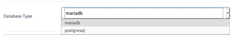
A drop-down list cannot be empty or have its value unselected. For this purpose, it is necessary to add an explicit empty value on the enum constraints.
Subsections 
When a property of type object is set with a form identifier, it will be rendered as a subsection. A subsection is a set of parameters that are grouped together:
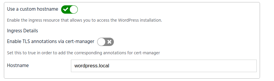
All the parameters within an object will be rendered in the subsection.
Note that in some cases, a parameter cause that the rest of the parameters are no longer relevant. For example, setting ingress.enabled to false makes the ingress.hostname irrelevant. To avoid confusion, you can hide that parameter setting the special tag hidden. The tag hidden can be a string pointing to the parameter that needs to be true to hide the element, or an object to also set the value that the pointed value needs to match as shown below:
{
  "hidden": {
    "value": "foo",
    "path": "bar"
  }
}
When using an object to set the hidden tag, you can also specify an array of conditions to match, and the conditional operator to use (currently supported: and, or, nor). The format is shown below:
{
  "hidden": {
    "conditions": [
      {
        "value": "foo",
        "path": "bar"
      },
      {
        "value": "baz",
        "path": "qux"
      }
    ],
    "operator": "or"
}
This is an example for a subsection with a parameter that can be hidden:
    "ingress": {
      "type": "object",
      "form": "ingress",
      "title": "Ingress Details",
      "properties": {
        "enabled": {
          "type": "boolean",
          "form": "enableIngress",
          "title": "Use a custom hostname",
          "description": "Enable the ingress resource that allows you to access the WordPress installation."
        },
        "hostname": {
          "type": "string",
          "form": "hostname",
          "title": "Hostname",
          "hidden": {
            "conditions": [{
              "path": ingress/enabled,
              "value": "false"
            }],
            "operator": "and"
          }
        }
      }
    },
Note that the parameter that hides another parameter doesn’t need to be within the section itself. In this other example, mariadb.enabled is used to hide some parameters within externalDatabase:
    "mariadb": {
      "type": "object",
      "properties": {
        "enabled": {
          "type": "boolean",
          "title": "Use a new MariaDB database hosted in the cluster",
          "form": "useSelfHostedDatabase",
        }
      }
    },
    "externalDatabase": {
      "type": "object",
      "title": "External Database Details",
      "form": "externalDatabase",
      "properties": {
        "host": {
          "type": "string",
          "form": "externalDatabaseHost",
          "title": "Database Host",
          "hidden": "mariadb/enabled"
        },
      }
    },
A parameter can also be hidden based on the deployment event install or upgrade, wherever they are no longer relevant.
    "mariadb": {
      "type": "object",
      "properties": {
        "enabled": {
          "type": "boolean",
          "title": "Use a new MariaDB database hosted in the cluster",
          "form": "useSelfHostedDatabase",
          "hidden": {
            "event": "upgrade"
          }
        }
      }
    },
The event condition can be combined into a array of conditions in the same way:
    "mariadb": {
      "type": "object",
      "properties": {
        "enabled": {
          "type": "boolean",
          "title": "Use a new MariaDB database hosted in the cluster",
          "form": "useSelfHostedDatabase",
          "hidden": {
            "conditions": [
            {
              "event": "upgrade"
            },
            {
              "path": "mariadb/enabled",
              "value": "true"
            }],
            "operator": "or"
          }
        }
      }
    },
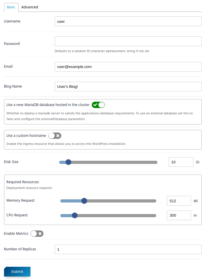
Example 
This is a working example for the WordPress chart
And the resulting form: